Today’s eLearning environment sometimes reminds me of one of my favorite movies… Austin Powers. In Austin Powers, a quirky British secret agent from the 1960s is cryogenically frozen and brought back 30 years later to a world that is very different from the one he left. Hilarity ensues.
Likewise, many of the eLearning courses that are available today seem to be cryogenically frozen from the early days of web-based training. While the surrounding world has undergone many technological, user experience, and design advances, most of the eLearning courses I’ve taken recently feel very 2001.
The result? A majority of today’s eLearning experiences are full of friction for users. Imagine trying to navigate a website from 2001 today. (Check out these throwback websites from 2001 for examples.) After some initial chuckling, you’d likely get quickly frustrated. After all, the look and feel, flow, and experience are very different than what you now expect.
A similar frustration happens with dated eLearning courses. People today are accustomed to visiting fluid and clean websites, communicating on intuitive apps, and working with cloud-based software. And then they open an eLearning course. And think, “woah, this is different.”
So why does this matter? It goes beyond just whether or not an eLearning course “looks nice.” When a learning experience is not intuitive and simple, the user has to commit extra mental capacity just to figure out how to navigate. Or has to pinch in and out and swipe around to view images or read text on their phone or tablet. And this detracts from the learning itself.
As Jeff Bezos, CEO of Amazon, once said about Amazon’s Kindle reading device, “we’re trying to get out of the way.” In other words, the Kindle device was specifically designed so that you forget you’re actually holding one and instead get lost in the book that you’re reading on the device. I think all eLearning courses should have a similar goal – design that “gets out of the way” so the participant can focus on what really matters… learning.
A 2016 study found that mobile devices account for nearly 2 out of every 3 minutes spent online. In the U.S., 90% of households have three or more internet-connected devices, with a majority having at least one smartphone, one desktop or laptop, and one tablet. There’s no denying that we live in a device agnostic world. One in which we expect to have an excellent experience with online sites on any device.
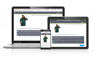
Enter responsive web design. In essence, responsive design means that the layout of the page adapts to the dimensions of the device to best display the content. Everything is fluid, proportional, and shifts when the device screen size changes.
Responsive design creates an excellent user experience on any device. Applied to eLearning courses, responsive design helps make courses intuitive, easy to navigate, and optimally displayed on phones, tablets, and laptops. With a clean, well-displayed course, the learner can focus on… you guessed it… learning. (See examples of responsive eLearning here on OpenSesame.)
There are many challenges associated with designing a successful responsive eLearning course. (That could be a separate article entirely.) But hopefully the trend I’m starting to see continues: we escape the 2001 design freeze and instead see more and more eLearning courses that align with our digital expectations today. Responsive eLearning design is one key way to help us get there.
Todd Macey is the President of Vital Learning, a Denver-based publisher of online and classroom leadership training. Check out Vital Learning’s new award-winning online courses on OpenSesame, which are fully responsive and optimized for any device.


